Product Type
Marketing website
Role
Creative Director, UX and UI Design Lead
Context
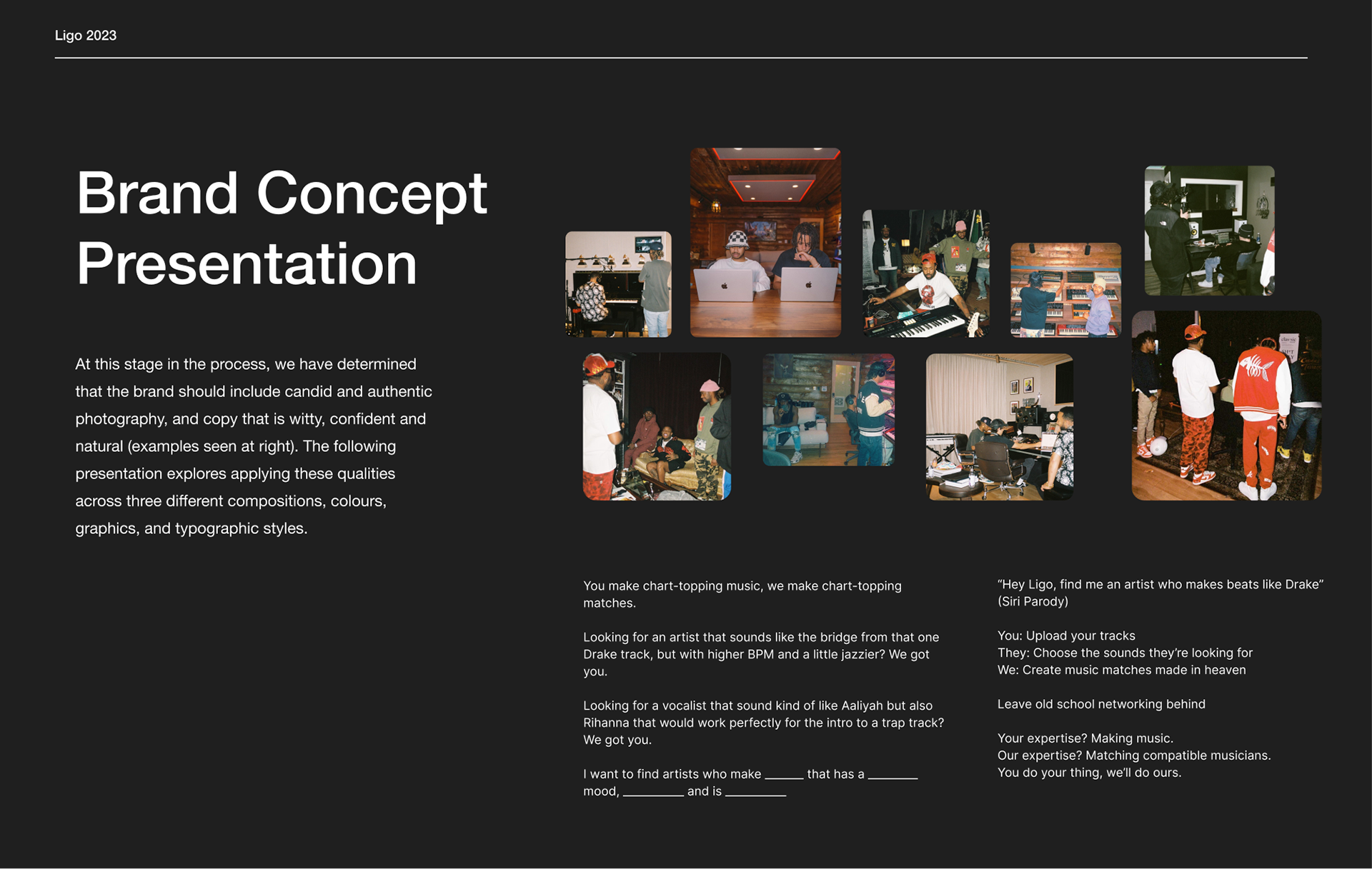
The goal of this project was to build a brand identity that resonated with the ideal target demographic for Ligo and utilize it to design a new marketing website. During brand workshops I conducted with the client, some keywords that came up were: authentic, confident, playful, organic, real, community-led, bold, and candid. As the music industry is intertwined with other creative industries such as fashion and design, it was imperative that the brand feel aesthetically relevant but not try-hard.
Process
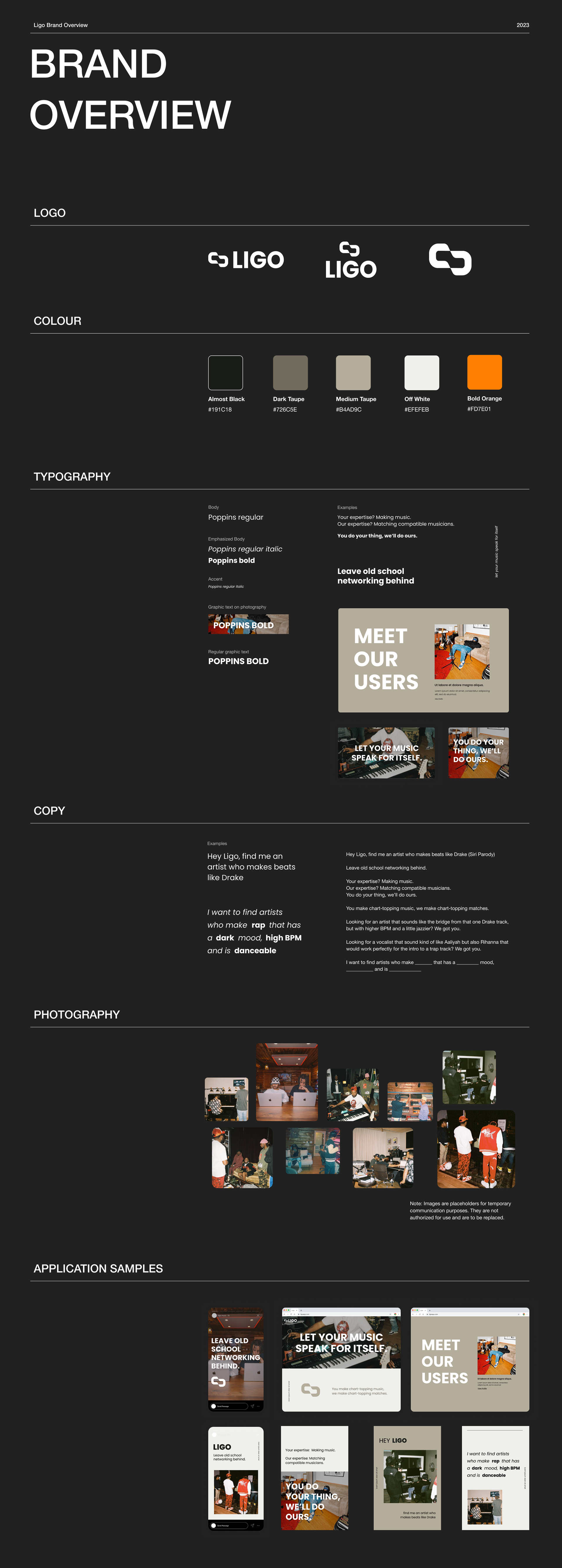
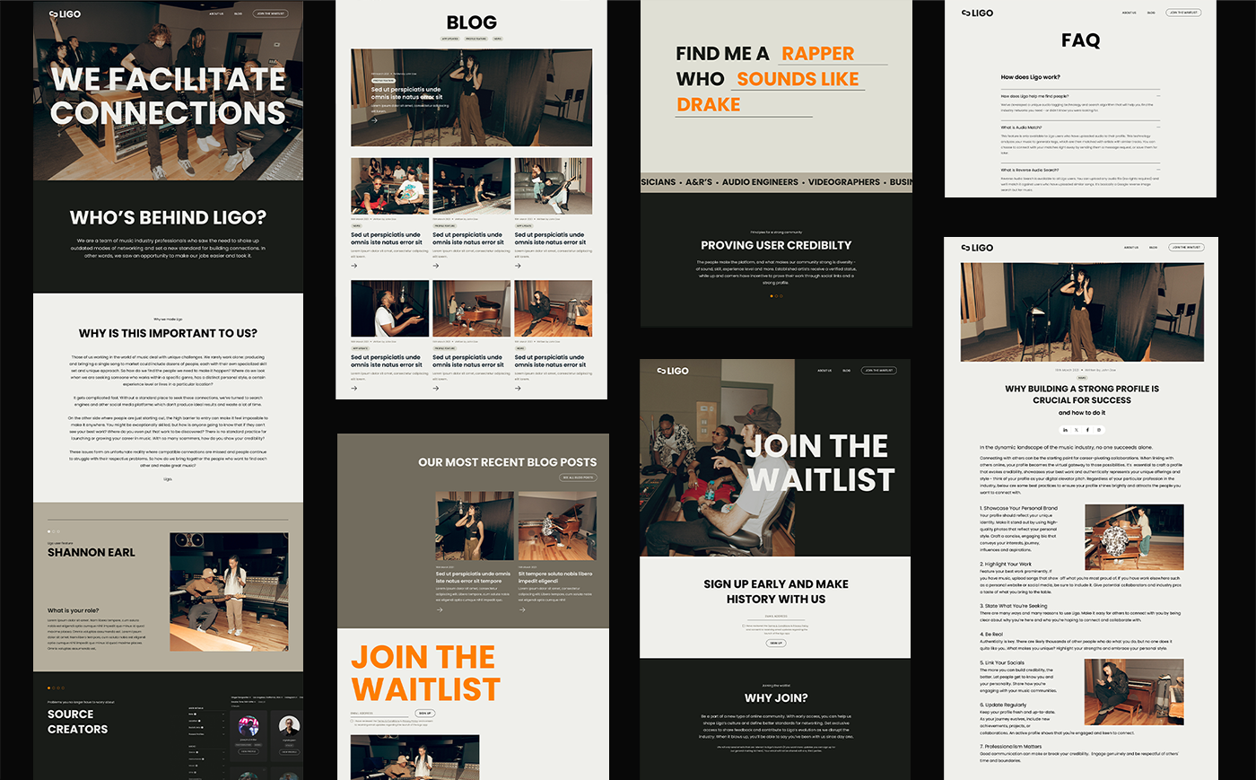
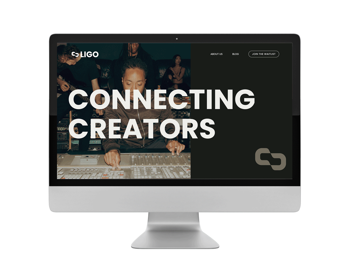
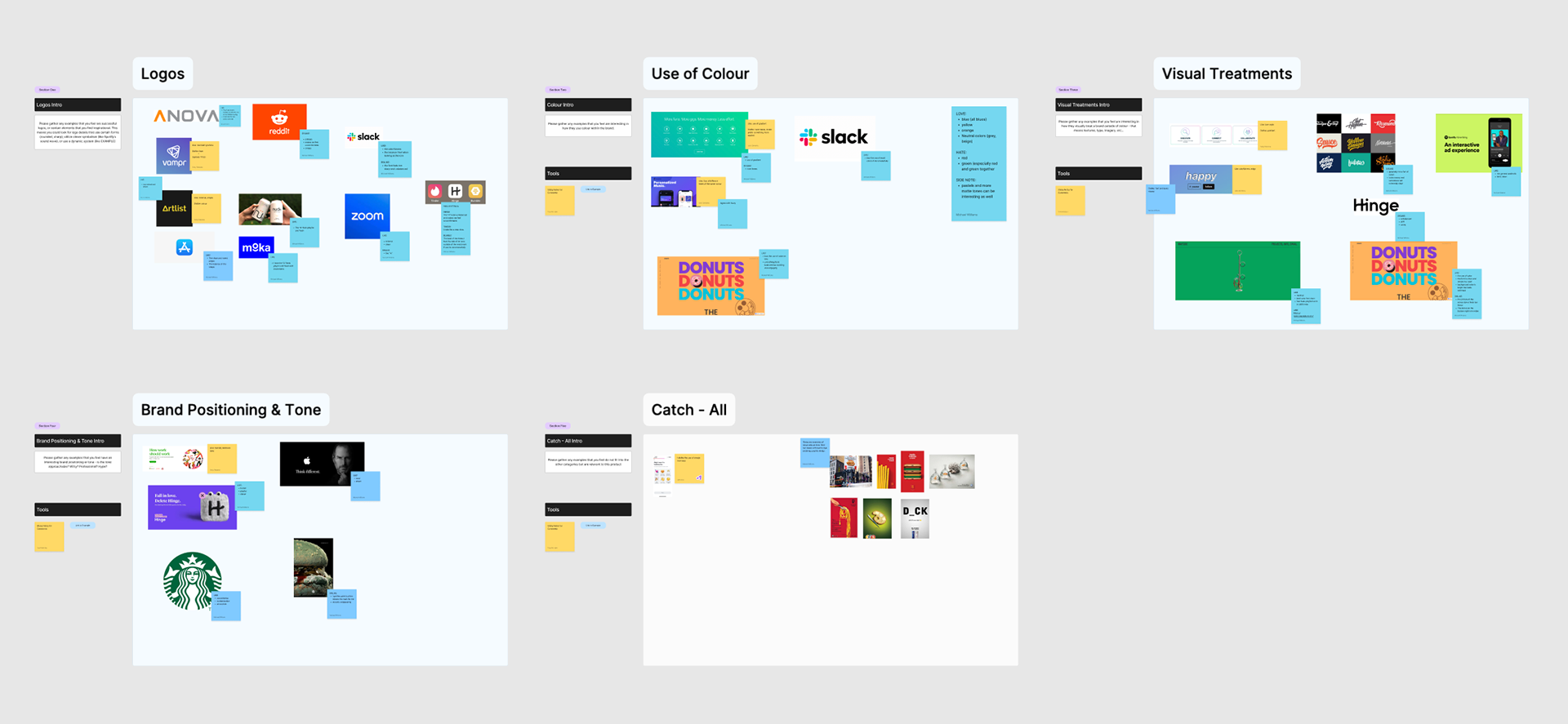
After conducting brand workshops to determine the client's vision and needs and a couple of rounds of mood boards, sample landing page mockups, and photoshoot direction, I arrived at the current brand guidelines, which include the logo, colour, photography guidelines, copy/tone and sample applications.
Screenshot of a branding workshop in Figma.
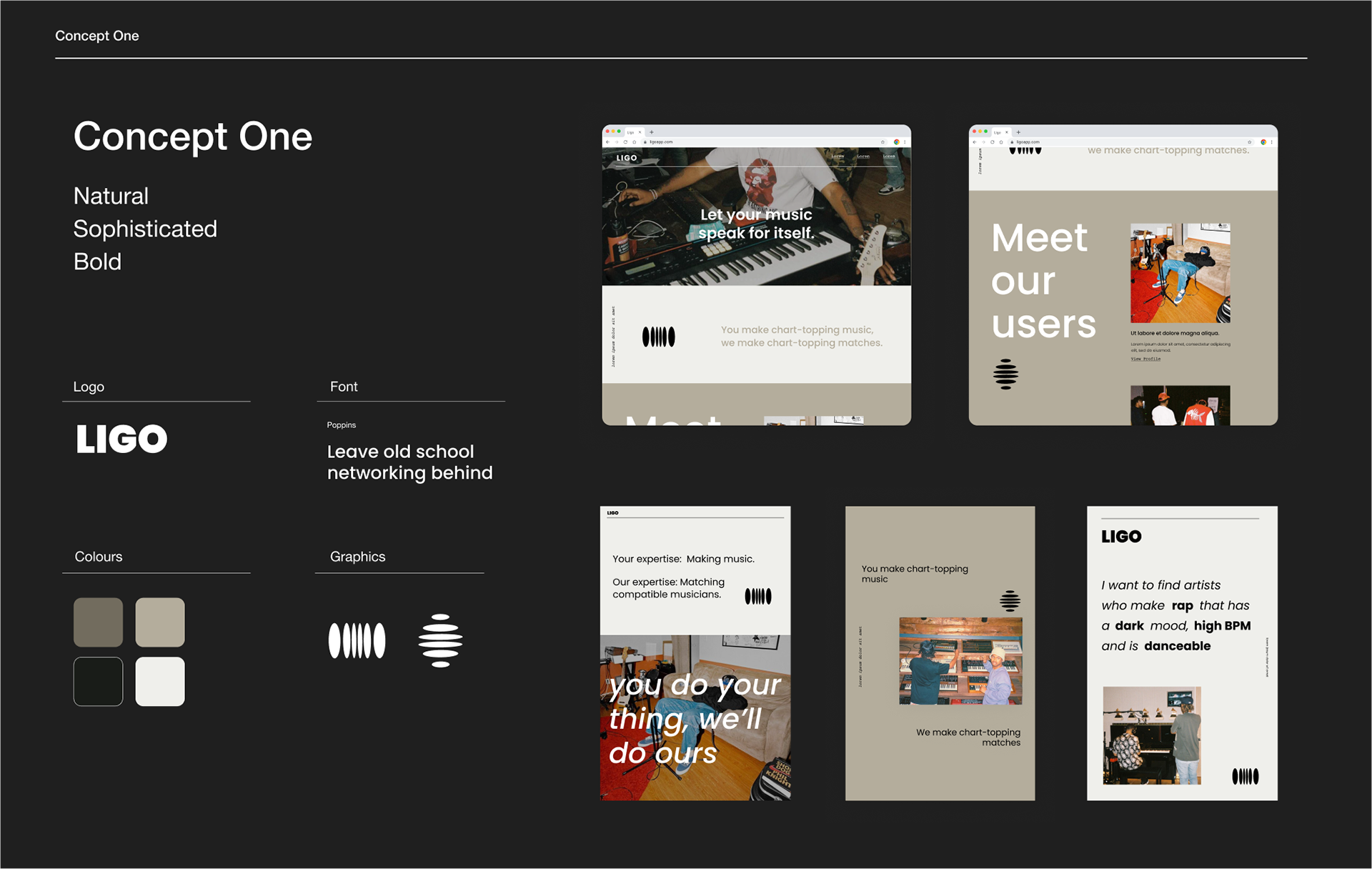
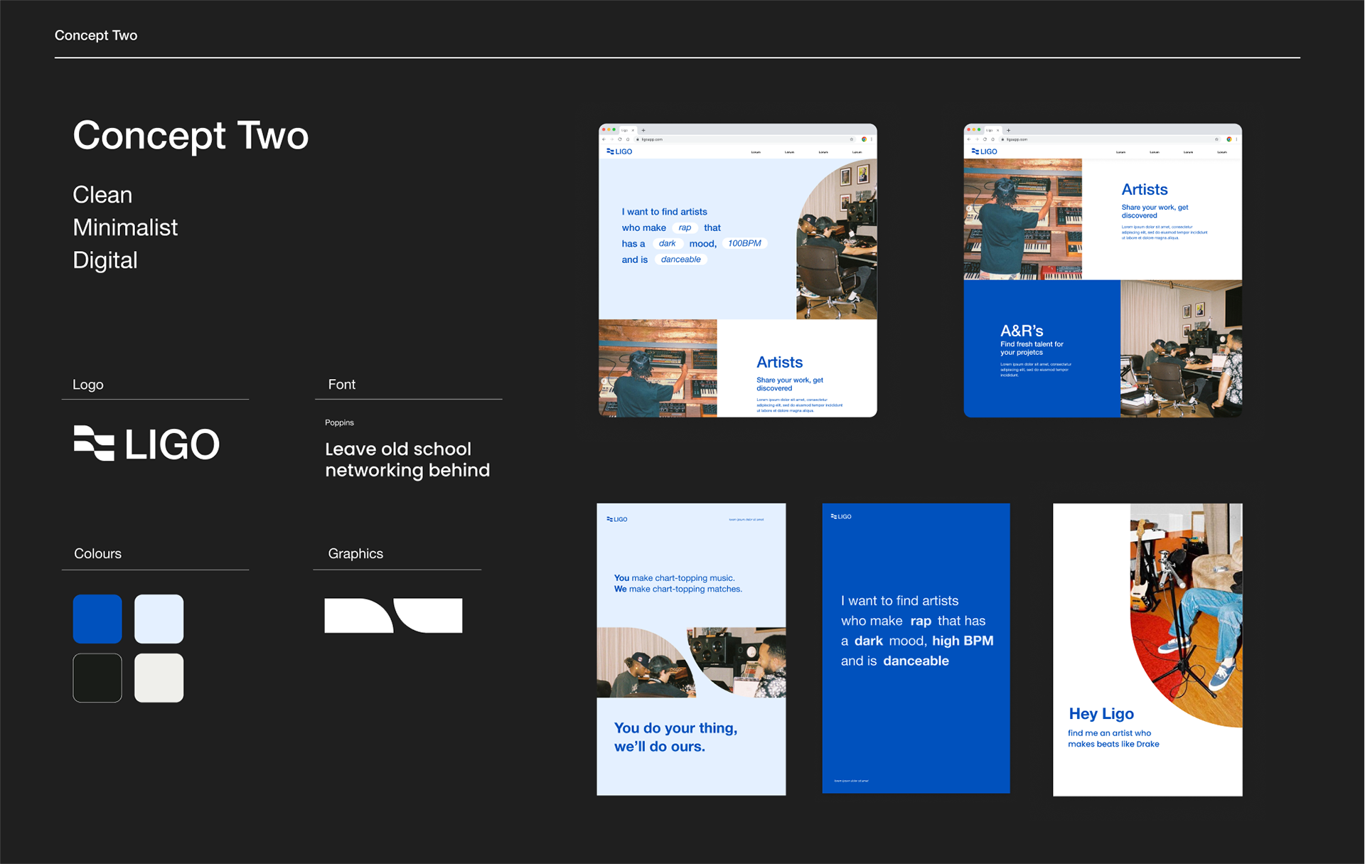
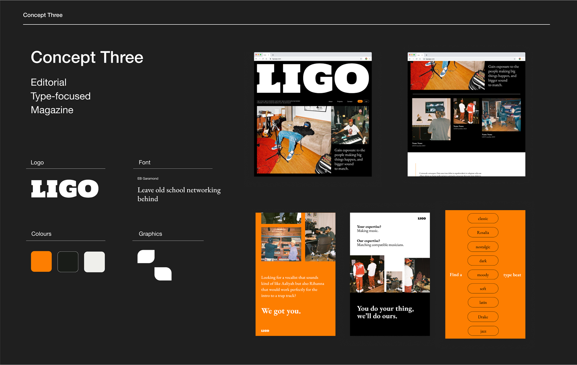
Images of brand concept iterations midway through the branding process. Concepts one and three were eventually combined.
Impact
The brand strategy utilizes photos of music industry folk collaborating in a candid environment. The clients, who were in the music industry themselves, explained that recording studios often feel more like a friend's living room than a swanky studio, and wanted the brand to reflect that. Orange was selected as a primary brand colour to reflect these warm qualities while also striking a boldness. The boldness is also exemplified in the all caps titles. To educate on Ligo's features and communicate it's value, candid, playful, direct copy is used in short phrases.