Introduction
Opus had an extensive product inventory that reached into tens of thousands of SKU's. When the business began, the inventory software it was using was state of the art, but as technology grew, the business soon found themselves in a difficult position as the inventory software no longer integrated with industry-standard website software, and with so many SKU's, switching over was a huge undertaking for a medium sized business.
Additionally, a niche development firm who knew the inventory software built the website, but it required several less-than-ideal workarounds in order to make it function. This made certain visual and functional updates challenging or impossible. In addition to these challenges in the back end of the website, there were no official brand guidelines, resulting in visual disconnect throughout the site and the brand as a whole. To work within these limitations while still striving to make improvements, I sought out areas that were possible to change, and kept visual designs as simple and minimal as possible so that they would not cause further disconnect within existing brand content.
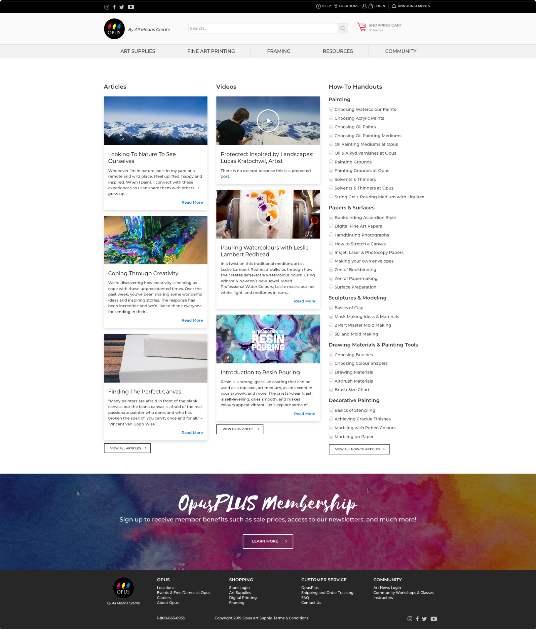
Resources Page
Before
○ There is no page title, which could be confusing for users and also cause accessibility issues
○ There are no breadcrumbs or active states in the nav, so the user may not know where they are or how they got there
○ Content is close with little white space, making it difficult to understand what content is related to other content
○ There is no way to search or filter content and there is a lot of it
○ The resources section in the navigation contained Project Tutorials, but they were not displayed on the Resources Overview page, while all other resource content was
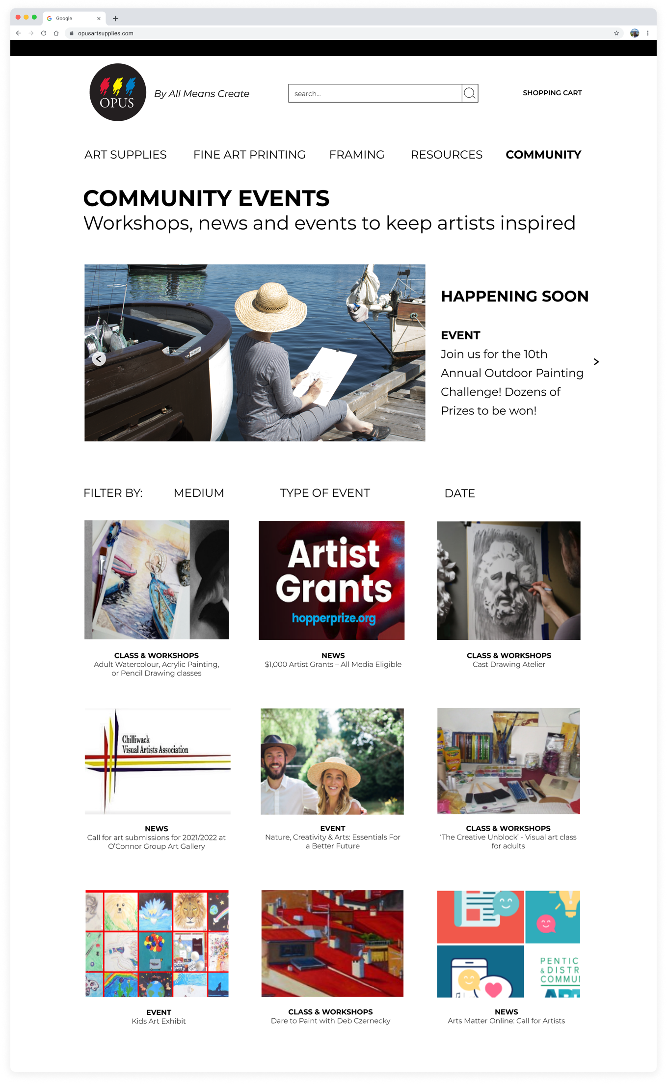
Proposed Solution as Mid-Fi Mockup
○ Add a page title
○ Improve overall page hierarchy
○ Add a banner carousel that highlights recently added resources, with live text beside it (not in the image, which was an accessibility issue throughout the site)
○ Add active state to nav to indicate what page user is on
○ Improve navigation by adding filters to search by medium or resource type
○ Include project tutorials so all resources can exist cohesively in one place, making them easier to locate and discover
Community page design before
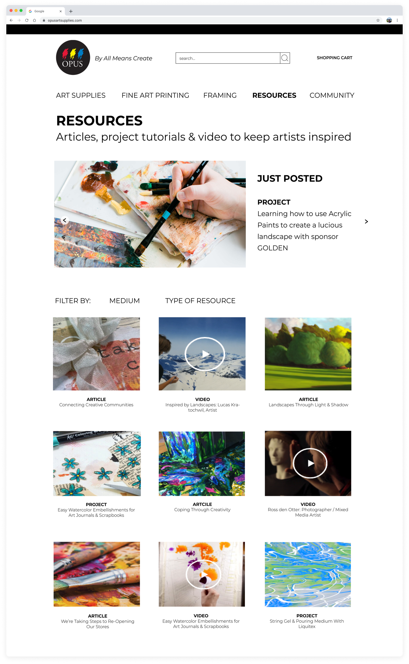
Resource page design proposal
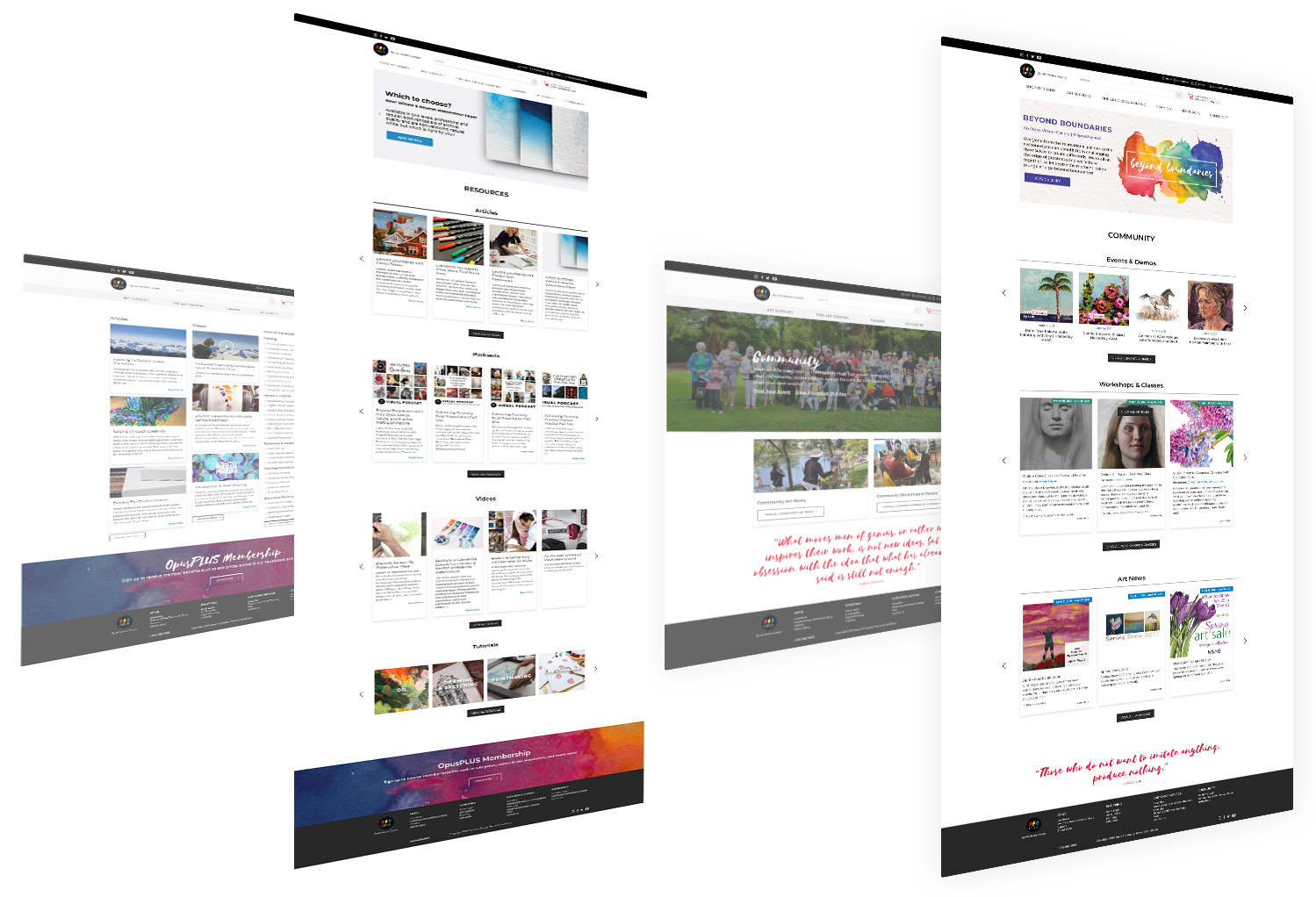
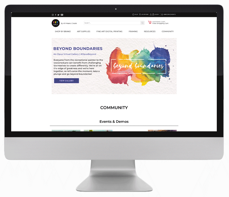
Outcome
In attempting to implement the solutions outlined above, we encountered errors in implementing filtering due to how content had been tagged in the back end, as well as challenges in applying changes to the navigation menu. Despite this, I was still able to make improvements to the overall user experience of the resource page.
Resource page design outcome
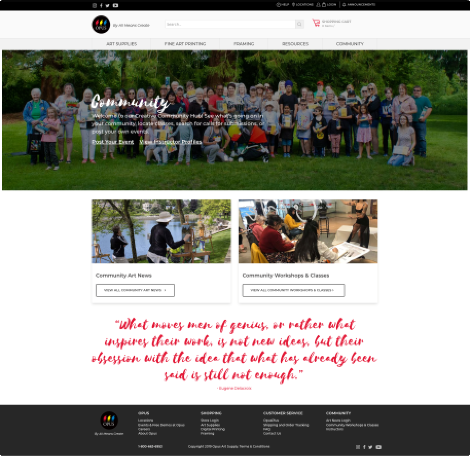
Community Page
The Community page had very similar issues as the Resource page - within the nav menu, its child pages were Art News, Workshops + Classes and Events + Demos, yet Events+ Demos didn't exist on the Community Overview page. Also, despite having very similar qualities and hierarchies to the Resources Overview page, it followed a very different design which increased cognitive load to figure out how to interact with it. I proposed that we follow a similar layout and logic to both pages, so that once a user had visited one page, they would know how to use the other.
Before
Proposal as Mid-Fi Mockup
Community page before
Community page design proposal
Outcome
The same issues presented with the community page - it was not possible to implement filters or changes within the navigation, but I was still able to make improvements to the overall user experience of the resource page by improving hierarchy, information architecture, discoverability of content and visual design.
Community page design outcome