Product Type
Marketing website
Role
UX and UI Design Lead
Context
Schoolhouse Moolah is a classroom management tool with a focus on financial literacy that is used in schools in the United States. With plans to release the app in Fall 2025, the client wanted the marketing website up and running leading up to the launch to have a place to direct interested users to gain more information.
I created the visual identity for the app and overall brand and led the design and strategy for the marketing website. I also owned the high fidelity designs of many key sections of the teacher's app, which can be viewed here as its own case study.
Process
Drawing from competitor and market research, I crafted a memorable visual style to resonate with both teachers and students alike while also setting the brand apart from competitors. I worked with the client, iterating and refining by facilitating brand workshops.
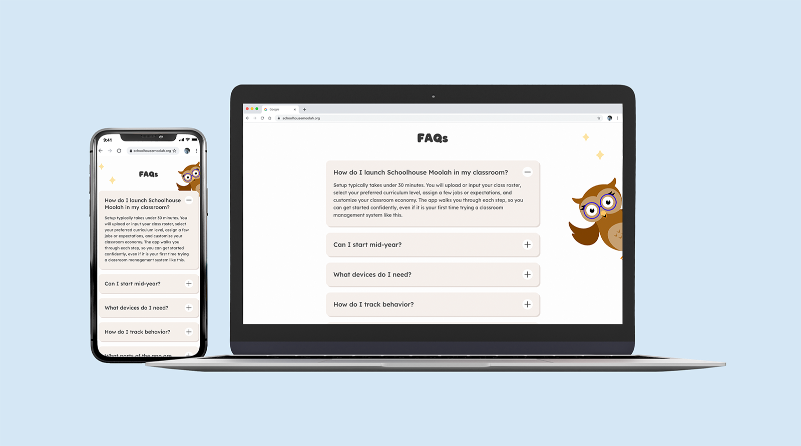
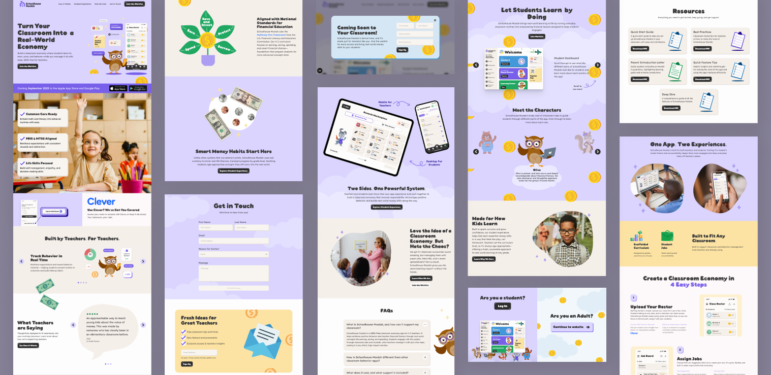
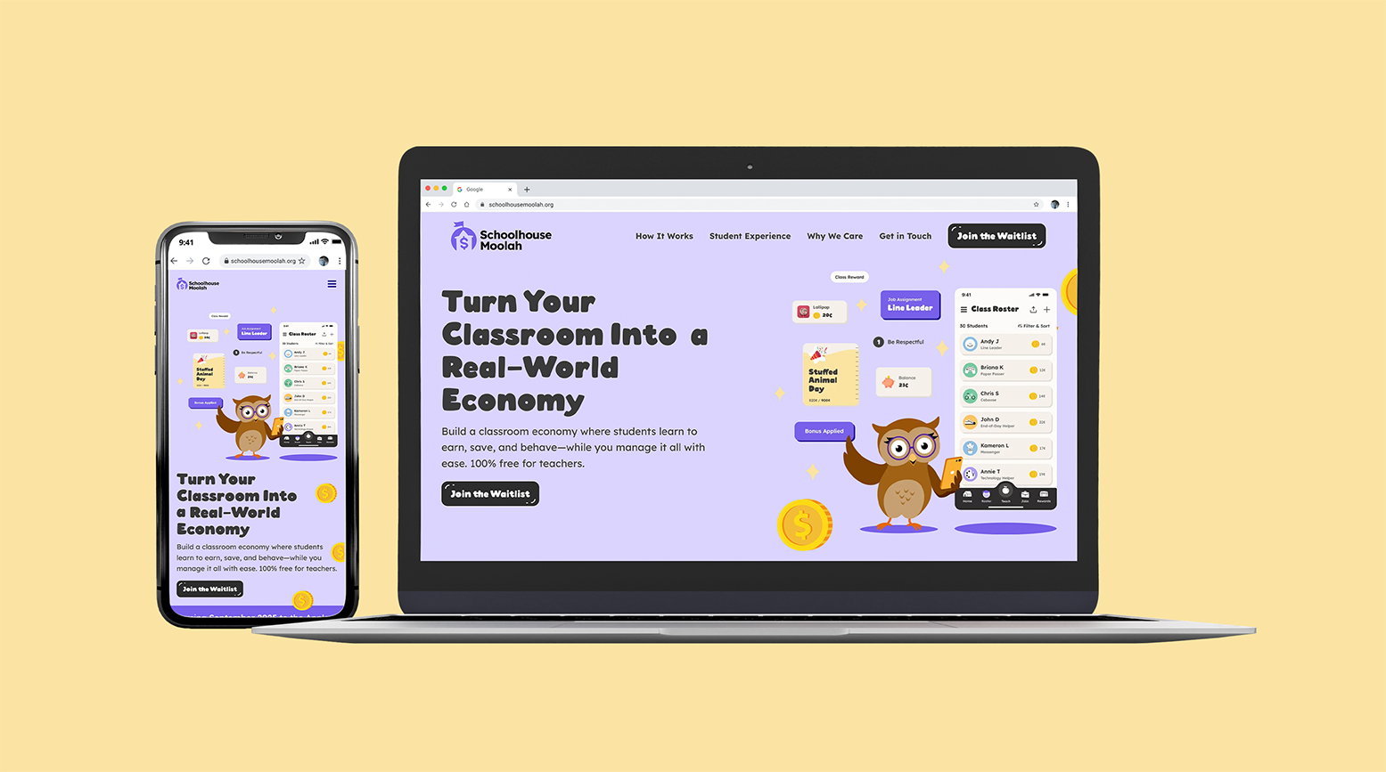
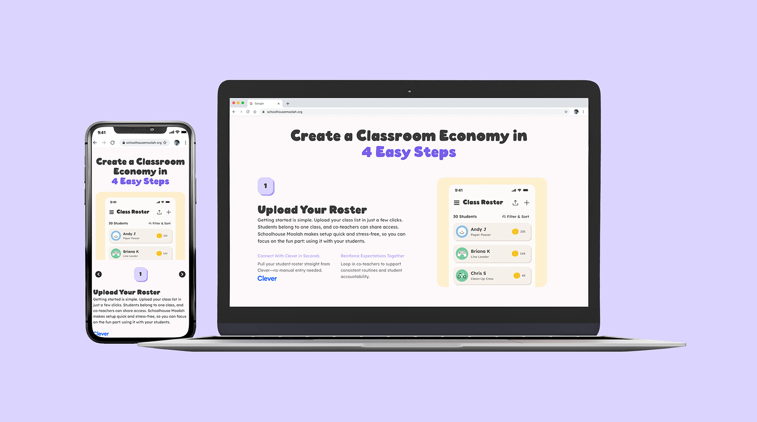
I worked with the client to strategize and build a flexible sitemap that allowed us to adhere to our tight launch timeline while also considering future growth and needs of the site. From here, I created wireframes, wrote copy, and then created high fidelity designs for desktop and mobile, building out re-usable blocks to ensure consistency and ease during development.
Crafting an identity that would appeal to a range of student ages as well as teachers was a challenge. Teachers informed us that children would quickly lose interest if something felt "babyish", but we also needed to ensure it was accessible and friendly for children as young as five. Additionally, it needed to be enticing to kids without creating overstimulation, which required a delicate balance.
I selected a playful, chunky display font and paired it with another that was created with dyslexic readers in mind, complimenting it with a palette of colours that felt fresh and accessible. Bubble buttons, graphic drop shadows, photos cropped in blobs and collage-style graphics using a blend of illustrations and photography all added to the fun aesthetic.
Impact
The final designs delivered a cohesive visual and interaction language, offering an approachable and professional experience for educators, students and parents. An organized sitemap and library of reusable components made development and scalability for future updates easy and organized. The client praised the work for its clarity, approachability, and alignment with their educational mission, laying a strong foundation for the product’s online presence and overall user engagement. The marketing website launched in Fall of 2025 and within the first month of the app's public release, over 30 teachers downloaded and actively used the app.